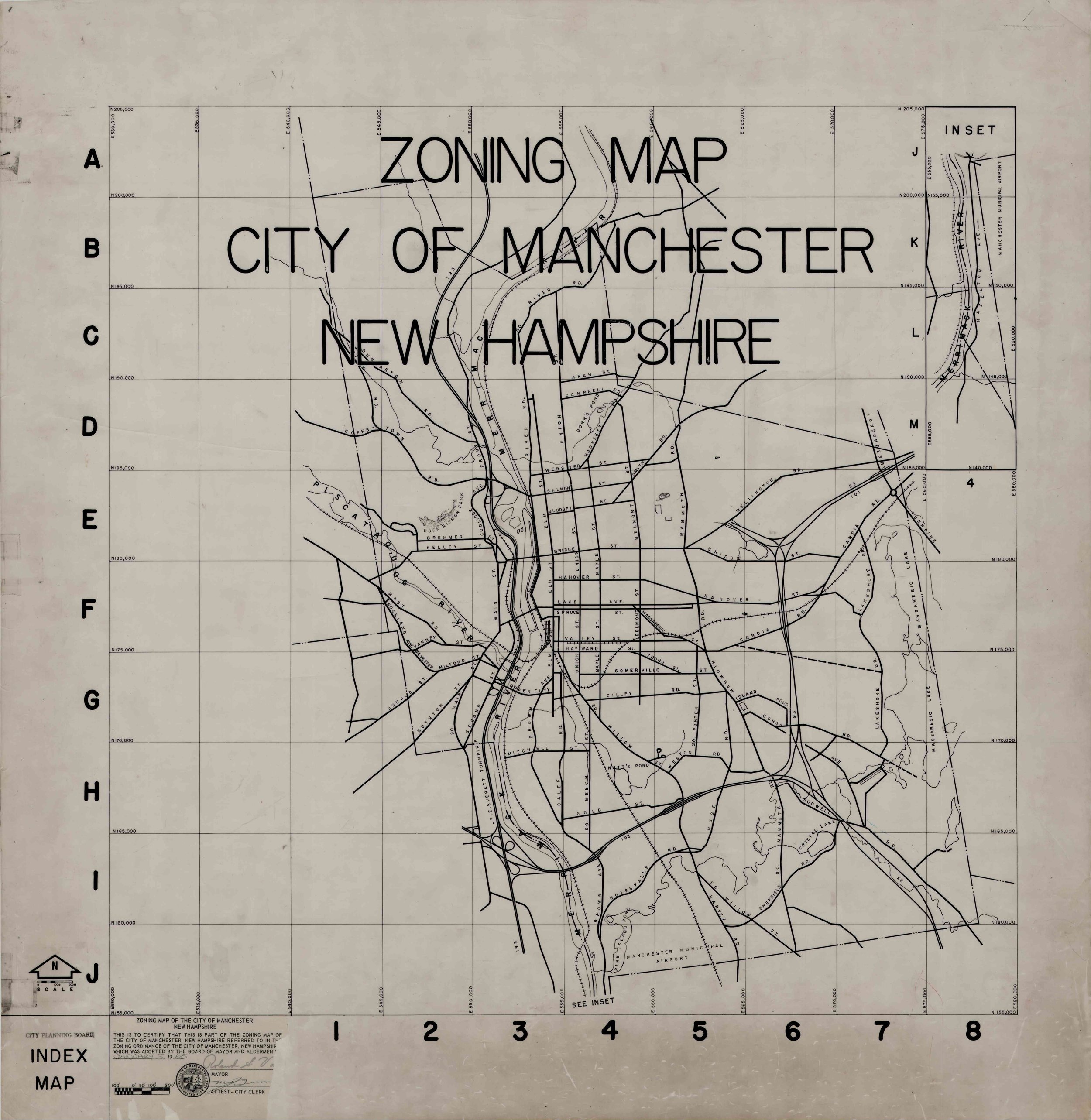
Historical Zoning Maps for Manchester

INVISIBLE WALLS

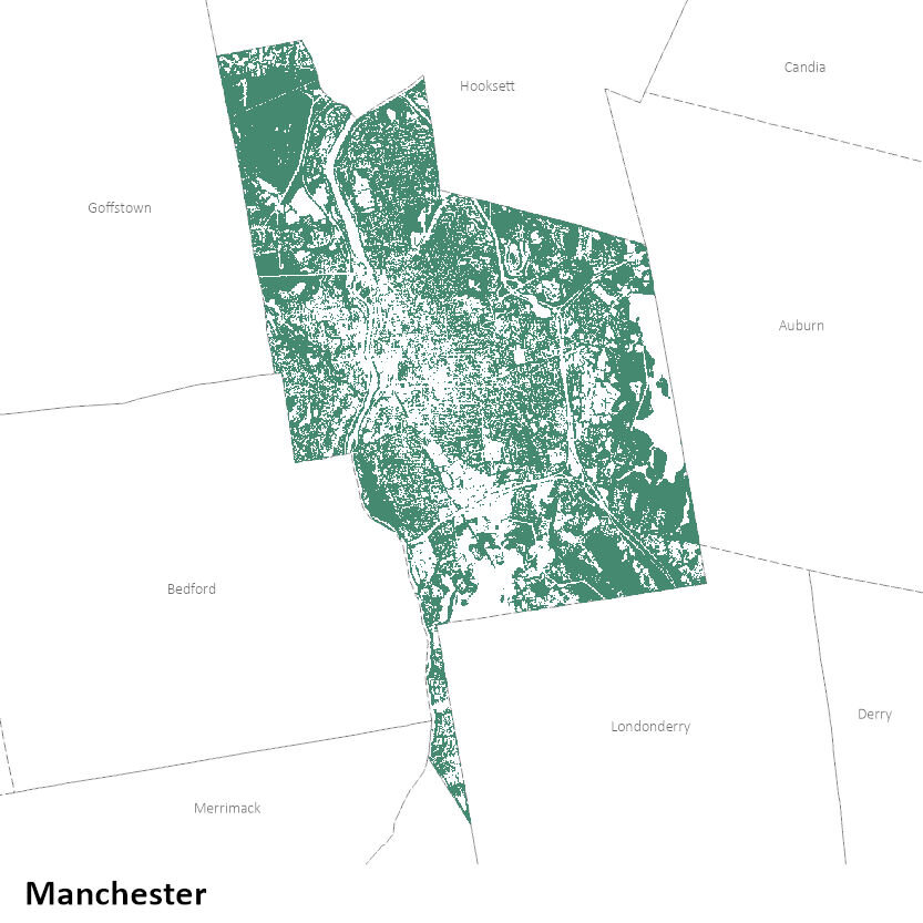
These shapefiles and geo-referenced image files show how the zoning maps in Manchester changed from the 1920s to the early 2000s.

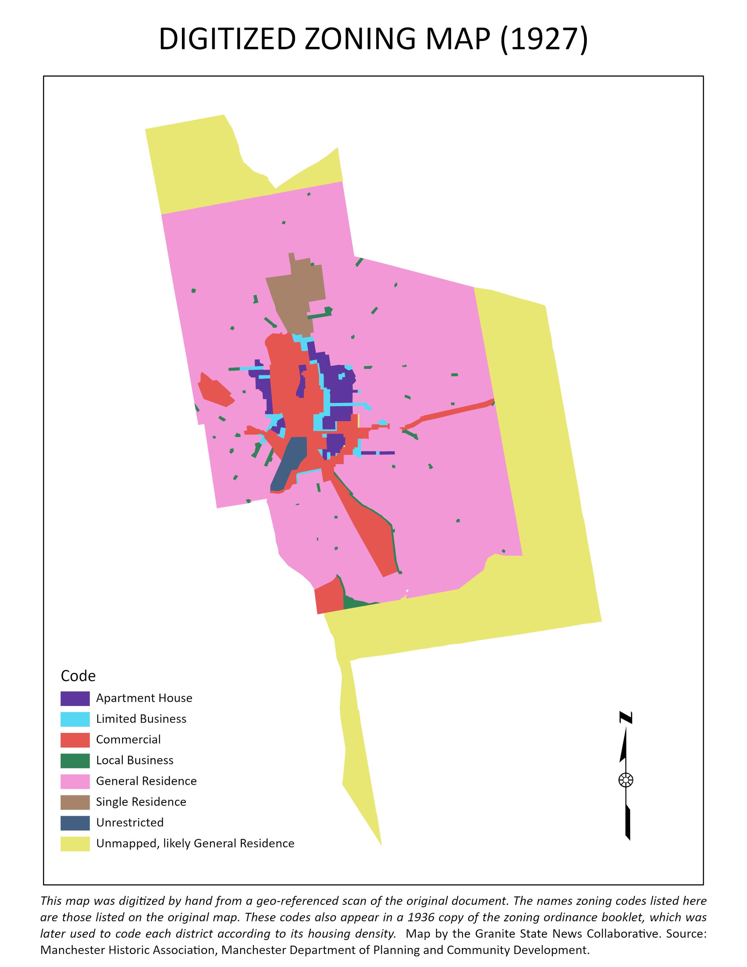
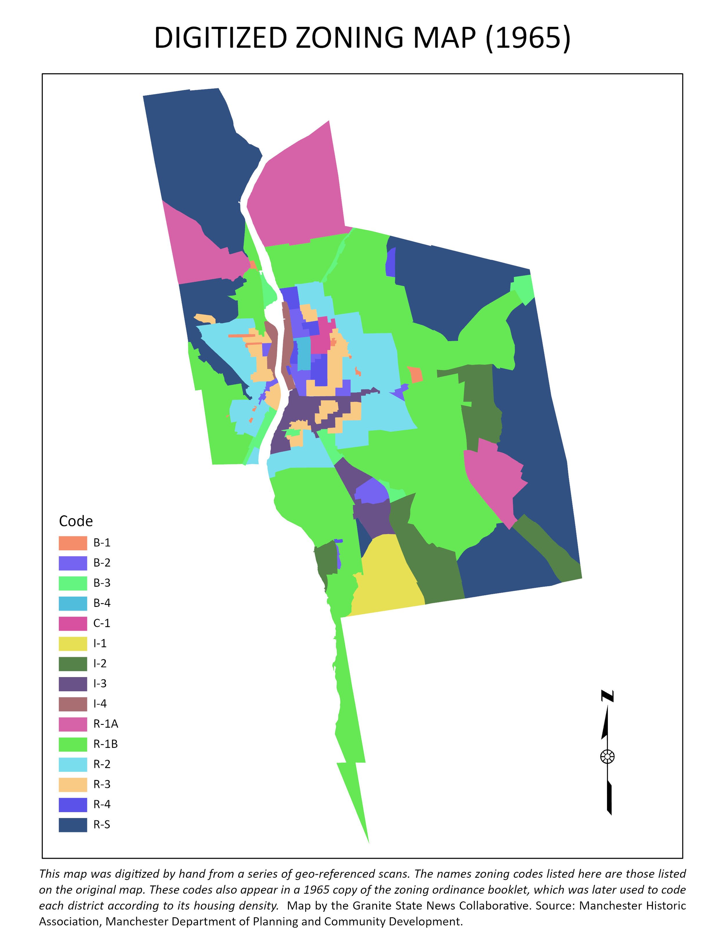
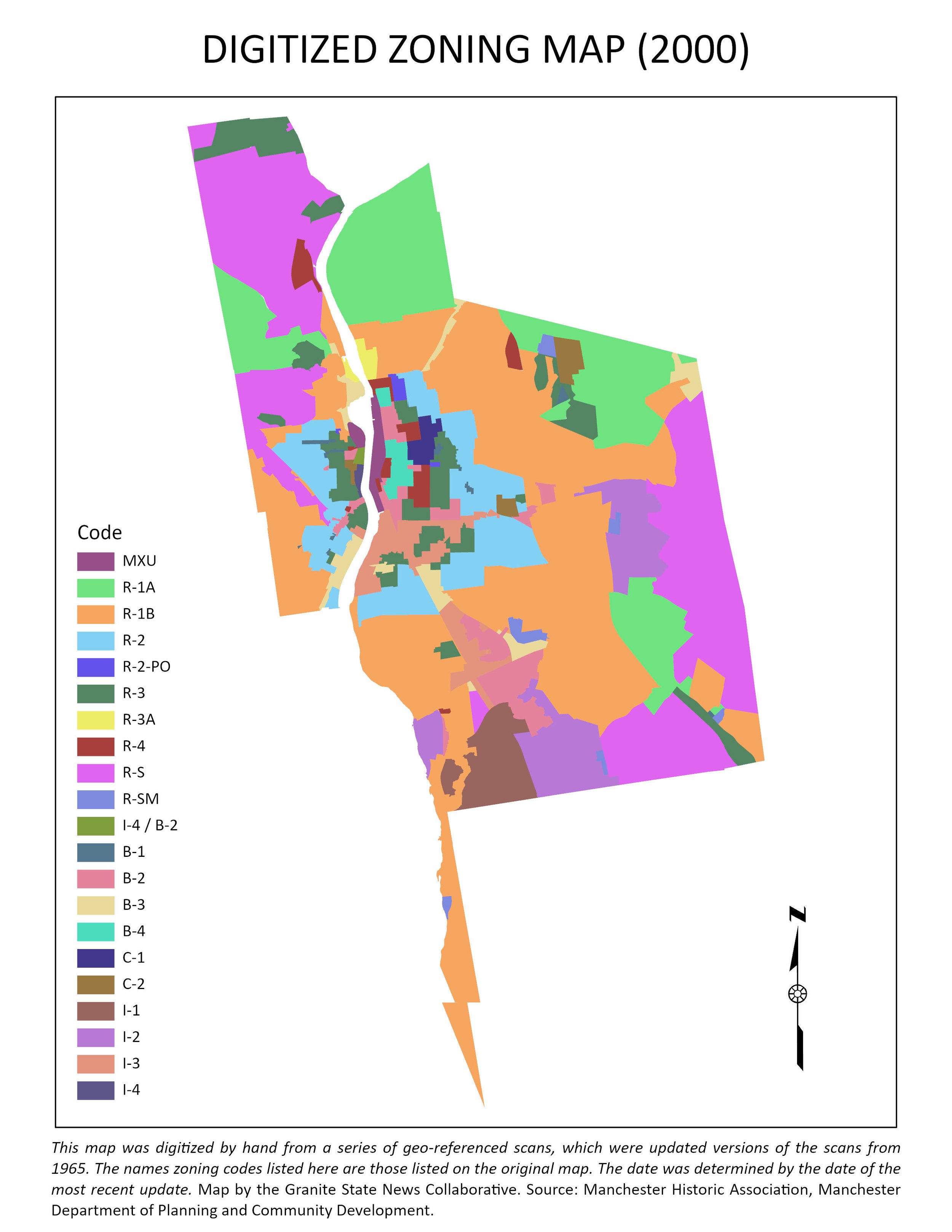
These files are the only analysis-ready versions of the maps that we know of. The scans were geo-referenced and digitized by Data and Research Editor Johnny Bassett.

We digitized these maps so we could see how residential zoning has changed in the city over time. After converting the maps into their current form, we consulted the available zoning ordinance booklets to standardize each map’s zoning codes by density. For example, single-family zoning was categorized as lowest-density housing in each map, while whichever category allowed the construction of the most units per structure was categorized as highest-density. This helped us make some basic observations about how zoning had changed in the city.

We are providing the scans we used to create the shapefiles, and we are providing the shapefiles with the coding as shown on the maps. We did not correct mapping errors that appeared in the original scans for 1965 and 2000, which were only available as indexed maps. (For example, please see the lightning bolt shape at the bottom of Manchester in both these years.)

Many thanks to the Manchester City Planner’s Office and the Manchester Historic Association for providing the underlying maps. Our thanks also go out to Bill Wilkinson, who helped with scanning.

Type: spatial

File: Polygon shapefile (.shp) and geo-referenced image file (.tif)

Source: Manchester City Planner’s Office, Manchester Historic Association. (Digitization was done by the Collaborative.)

Last Updated: January 2022

Lead Poisoning Data

This spreadsheet describes key aspects of the state’s ongoing effort to reduce the risk of childhoold blood lead poisoning.

This dataset provides more details and chronological context than is available in other materials published by the Department of Health and Human Services.

We requested this data from DHHS because we could not find other sources that described the magnitude of blood lead poisoning’s impacts on specific demographic groups and how successful the state has been at reducing those impacts. This data gave us the answers we needed.

Many thanks to the DHHS’ Bureau of Health Statistics and Public Information Office for providing us with this resource.

Type: Statistical

File: Excel spreadsheet (.xlsx)

Source: NH Department of Health and Human Services

Last Updated: January 2021

Heat-related Emergency Department Visits

Datastore_DHHS_EDVisits-spreadsheet.PNG
Map_Statewide_ED Visits by Hospital_PUBLISH.png

EXAMPLE USAGE

This Excel spreadsheet and point shapefile shows the total number of heat-related ED visits by NH residents by hospital between 2012 and 2019.

This data comes with a more detailed spatial breakdown than what DHHS offers via their online Data Portal.

We requested this hospital-level data from DHHS because we wanted to illustrate the spatial distribution of heat-related illnesses below the level of the county. The 26 hospitals reporting data in this spreadsheet allowed us to do that, especially in the southern part of the state.

Many thanks to the DHHS’ Bureau of Health Statistics and Public Information Office for providing us with this resource.

Type: Statistical, spatial

File: Excel spreadsheet (.xlsx) and point shapefile (.shp)

Source: NH Department of Health and Human Services, NH GRANIT

Last Updated: August 2021

Urban Land Surface Temperature

Map_4City_4x3Grid_PUBLISH.png

EXAMPLE USAGE

These geo-referenced image files show city-wide variation in mid-summer land surface temperatures for four NH cities: Concord, Manchester, Nashua, and Rochester.

The layer shows how much cooler or hotter each part of the city is relative to the citywide average. We made the layer for a project about heat-related illnesses, which was published in summer 2021.

We made this layer in ArcMap and ArcGIS Pro using analysis-ready data from USGS’s Landsat Provisional Surface Temperature dataset. First, we selected images for three cloudless days in July between 2015 and 2018, using the provided error layers to make sure data for our cities was as distortion-free as possible, and averaged the temperatures across those three days. Second, we removed water bodies to focus our calculations on land. Finally, to emphasize relative temperature differences within each city, we calculated each point’s deviation from the city-wide average temperature.

Type: Spatial

File: Raster (.tif)

Source: USGS

Last Updated: August 2021

Urban Tree Canopy

Map_4City_4x3Grid_PUBLISH.png

EXAMPLE USAGE

These geo-referenced image files estimate the tree canopy for four New Hampshire cities: Concord, Manchester, Nashua, and Rochester.

We made this layer for a project about heat-related illnesses, which was published through the Collaborative in summer 2021. We wanted to estimate tree cover because trees are closely related to several environmental factors at the neighborhood level, including heat. We found, however, that this layer wasn’t available for NH, so we decided to make it ourselves.

We made the layer in ArcMap and ArcGIS Pro by approximating part of a workflow used by the University of Vermont’s Spatial Analysis Lab to identify trees from a combination of LiDAR and satellite imagery (NAIP NDVI).

Our layer identifies most trees in each city, but there are still some errors (e.g., trees that we’ve missed, or other objects that we’ve accidentally labelled as trees), so we think the map is currently only useful for seeing patterns at the level of the city or neighborhood. We’re currently working on making it more accurate.

Type: Spatial

File: Raster (.tif)

Sources: NH GRANIT (LiDAR), USGS (NAIP NDVI)

Last Updated: August 2021